
Mr Kan Tai Keung is one of the greatest HK graphic designers in the 20th Century, he started to work as a graphic designer in 1957, and he is still active in design activities. Today, his reputation is well established.
1)
Beijing Olympic Posters


To celebrate the 2008 Beijing Olympics, Mr. Kan designed a series of posters.
These posters are designed by ink brushes and chinese rulers. Mr Kan said that rulers represents a standard, and that's why he loves using rulers in his design jobs. As his regular style, he use brush strokes to create the human shapes.
I like these posters as the brush strokes shows the movement of the body, and it is neat and tidy. Moreover, it is the Beijing Olympic, therefore using the brush stroke is a very good way to link up with the topic.
2)
Heritage Posters

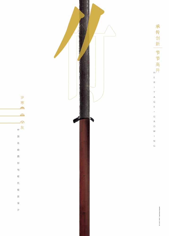

These posters are designed to match the traditional Chinese symbol with contemporary design style.
Once again, he used brush strokes and rulers to form the poster. This time it is placed vertical, and these three posters each represent a tree. They are pine tree, bamboo, and blossom. In Chinese, they are called the friends of winter, as they can stay strong in cold weather.
I like these 3 posters as they shares the same stroke, but they differentiates and have different tone and manner. The pine tree is cool, and the bamboo is hard, and the blossom is warm.
3
Moutain (Not Moutain)

This is a painting painted by Mr Kan. In this painting, he is doing both calligraphy and also painting.
The form of all the paintings are the chinese character 山, it means mountain.
When we look at the painting from far distance, we can read the word. If we move close to the painting, we can see the detail scenery of the mountain.
The way that Mr Kan played with the portion of the objects creates 2 ways of viewing the image, and it brings more insight to the viewers.
All of the above pictures are from Kan & Lau Design Consultant Ltd.
沒有留言:
張貼留言